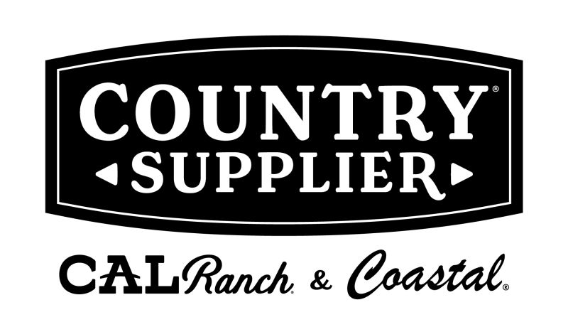
When I joined Country Supplier — the parent company formed to unify CAL Ranch and Coastal Farm & Home — my role extended beyond creating marketing materials for the subsidiaries. I was also asked to help define the parent company’s identity from the ground up.
The objective wasn’t flash or fanfare; it was stability, longevity, and trust. I developed an early logo concept intended to quietly represent two legacy brands without disrupting their individuality. Although the parent company has never made a public launch, that mark remains in use today — unchanged, unannounced, and still doing its job.
> the_challenge
Design a parent-level identity that served as a unifying structure rather than a public-facing brand. The visual language had to communicate strength, credibility, and neutrality — something that would feel at home above two well-established retail personalities.
The company was navigating a merger, redefining operations, and balancing multiple internal perspectives. The solution needed to be timeless, adaptable, and politically neutral — a logo that would hold weight in the boardroom as much as it did on internal documents or corporate letterhead.
> the_approach
I collaborated closely with the CFO, VP of Marketing, and cross-departmental leads from both CAL Ranch and Coastal Farm to understand their combined priorities.
Rather than push for visual novelty, I focused on structural integrity — proportion, balance, and legibility. The goal was to build a mark that felt inevitable: simple enough to outlast design trends and strong enough to symbolize corporate unity.
Rather than push for visual novelty, I focused on structural integrity — proportion, balance, and legibility. The goal was to build a mark that felt inevitable: simple enough to outlast design trends and strong enough to symbolize corporate unity.
At the same time, I supported the marketing teams for both subsidiaries — assisting in the credit card and rewards program branding, campaign development, and the early rollout of HIVE, the company’s new project management platform.
> the_outcome
The Country Supplier logo I created was among the first concepts submitted — and the one that endured. Despite later redesign efforts by other designers, the company continues to use that original mark today.
Its quiet persistence became a reminder that lasting design isn’t about attention — it’s about alignment.
> my_reflection
This project taught me one of the most valuable lessons of my career: sometimes the most successful design work is the kind that quietly survives the test of time.
Designing for longevity is an act of humility. It’s about restraint, empathy, and understanding how visual identity can serve a company’s mission without seeking the spotlight.
It reinforced my belief that true creative direction isn’t about being seen — it’s about building things that endure.
// Corporate Identity Concept — Country Supplier